

Applications of Interactive Media Graphics
Interactive media is the integration of media into a digital computer environment, this is includes text, moving images, sound and any digital device that is connected to a network.
Where to Find Interactive Media
Interactive media plays a big part within today’s media industry and is big business. The most common place to find interactive media is within the world wide web. Interactive media can consist of navigation bars, menus and rollover buttons these can all be found within a basic website or a web browsing navigation site. Interactive media has many levels of complexity from simple buttons which change colour to fully interactive games. Navigation menus are drop down menus with subheadings; these can be created using programmes such as Photoshop (used to create the graphics) or Dreamweaver (used to create the interactivity).
Lossless Format and Vector Graphics
Lossless is a media image type which is created where the image/graphic can be sized or blown up to any size without loosing any quality. A Lossless media image type is also created by geometrical build and doesn’t use pixels hence the file can then be used on a large scale with no quality loss. Lossless files can be used for graphic designs on anything from posters and full scale prints. Lossless file are also know as Vectors (an image or graphic that is created upon geometry).
Vector graphics are the most common form of a lossless format. They are created using programmes which; instead of building a graphic using pixels like a raster image, the vector graphic uses mathematical geometry to build the graphic. This means the graphic can be used at any desired size. However a vector graphic is alot less detailed than what a raster graphic would be because of this. Vector graphics are most commonly created for a commercial use such as logos, posters and banners. The programme that is most popular to be used to create vector graphics is Adobe Illustrator.
Vector Formats
AI: Adobe Illustrator is the leading vector graphics editor; it is developed and marketed by Adobe Systems.
CGM: Computer Graphics Metalife is a file format for 2D vector graphics and raster graphics.
CDR: CorelDraw is a vector graphics editing tool, it is mainly used for drawing purposes.
SVG: Scalable Vector Graphics is a family of specifications of an XML based file and is used for 2D vector graphics that are both static and dynamic.
DXF: Drawing Exchange Format is used for enabling data interoperability between AutoCAD and other graphical programs.
WMF: Windows Metalife is a vector graphics format developed on the windows systems; it stores a list of functions that have to be issued to the windows Graphics device.

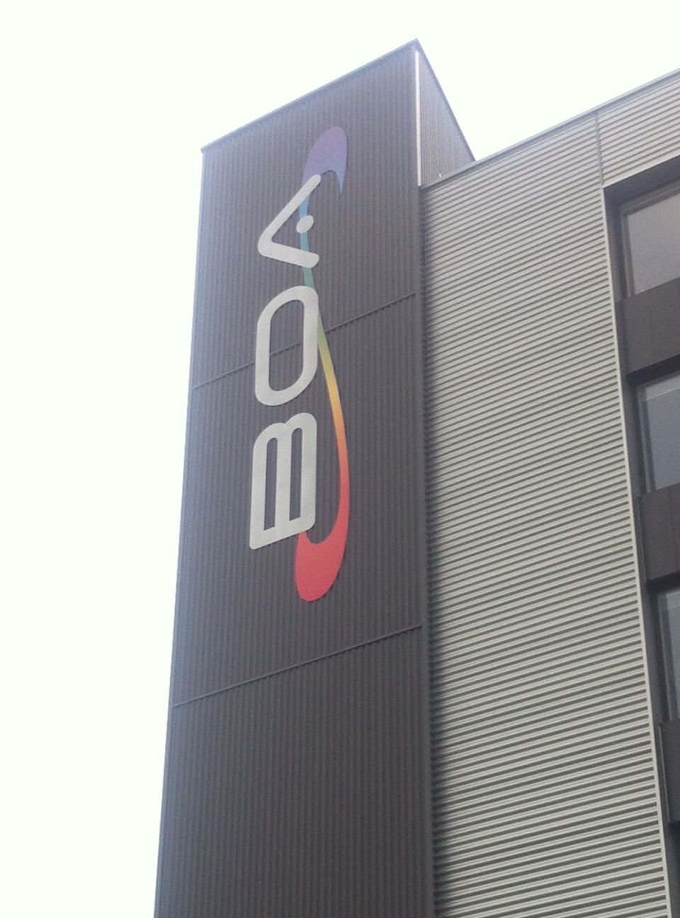
These are some examples of logos and graphics which would have been produced in raster format and scaled to size. I took these photos from the BOA building. The logos situated around the building which have been printed and built for a high quality use. You can see that the kind of graphic type works perfectly for this kind of large scale use.
![image[2]](https://boaelliot.wordpress.com/wp-content/uploads/2013/03/image2.jpeg)
![image[3]](https://boaelliot.wordpress.com/wp-content/uploads/2013/03/image3.jpeg)
Lossy Format and Raster Graphics
Lossy Compression file formats are image and graphic formats which are normally used within every day use such as, internet images, small scale printing and photographs. Many detailed images will be in a Lossy Compression file format meaning the file cannot be enlarged from its original state without loosing quality.
Raster graphics are a type of image format in which the image is made up of pixels to create a detailed image. However raster graphics when enlarged lose graphical quality and can looked pixelated or blurred. Raster graphics are usually used for digital use such as on a website or printed to a size appropriate to the pixels so that no quality is lost. Raster images are the most used type of image as photographs are also taken in raster format. Raster graphics also can be used in bitmap format as the file is a dot structure which is represented as rectangular grids of pixels and colours. When raster graphics are enlarged and analyzed their colours of pixels are constructed of using different values of red, blue and green. This is called the image RBG. Raster graphics can be created within many different programmes on a computer such as Adobe Photoshop, the most popular graphic and image creation programme. The programme creates raster graphics and can be saved as many different file types however.
Raster Formats
JPEG: Join Photogenic Experts Group is one of the most commonly used formats for raster graphics.
PSD: Photoshop Documents stores an image with support for most imaging options available in PhotoShop. It restricts content to provide streamlines, predictable functionality.
GIF: Graphics Interchange Format is a bit-mapped file format which is used frequently on the internet. It supports 256 varying colours and various resolutions.
PNG: Portable Network Graphics is a raster graphics file format, it supports lossless data compression.
BMP: Bitmap image file is a raster graphics image file format used to store bitmap digital images.

Pixels
A pixel is a physical point of a raster image, its also know as a picture element. Pixels make up the base of a raster image and form the base resolution of a raster graphic. Pixels are also the smallest controllable element of a graphic or image. The resolution of a graphic or image is determined by the amount of pixels; this means that each pixel can be a variable of the image or graphic and can be changed at any time.
Image Capture
When taking a photograph on a camera the most common format that the image is saved as is a raster .jpg (JPEG). The mega pixel on the camera will determine the quality and resolution of the raster image captured. When capturing video the quality of the camera will also correspond with the video quality that is captured. Scanners are also another way of image capturing. Anything scanned into the machine will also be saved as a raster image.
Image Optimization
Image optimization is the balance between the image resolution and the size of the application of the image and getting the correct balance between the both. Image optimization is usually just referred to when talking about the optimization of a raster graphic as the resolution and size of the application must be taken into consideration before being used. To get the best image possible, you need to think about what the best image output is, if you have want to watch something in HD then the best image output is 1080p. For large size uses the bigger resolution is better and also the colours should be in full RBG and not a bitmap settings.
Criteria 2 – Image Manipulation
Wallpaper Creation
The importance of Photoshop when creating art for game design is undeniably important. The skills in Photoshop can be used to create logo’s, art, concept art, character design and graphic design. As the skills can be so widely used they are crucial in making professionalism and industry standard work. Many jobs within the games industry also will require basic if not advanced skill in Photoshop.
I firstly wanted to mix up drawn art and computer art to create a wallpaper which I could test different skills on.

I firstly drew a picture of a character which I would import into Photoshop and then digitalize.

This was the completed Character. I coloured and posterity the outlines then used colour pallets to fill each section using the Magic Wand and Quick Selection Tool. After completing the base of the character I added a Paper filter and Motion Blur to make the character seem more hand drawn rather than digitally edited.

The airplane in the wallpaper was created fully in Photoshop and wasn’t hand drawn. I followed the same steps as I did with the character once I had drawn out the airplane outlines. I also added bullet effects onto the airplanes guns which I sourced from the web. I added motion blur effects and changed the colour and transparency level.

The Background was also sourced from the web just to test the effects I could use. I changed the hue and saturation to make the colours of the clouds more blue and change the white light to a darker yellow.

This was the final wallpaper I had created. I also added a balcony which I drew straight in Photoshop. I also put the layers together to create a scene which would serve as the final Wallpaper.
Park Bom Halloween Edit
Before

This was the original image that I sourced from the YG Entertainment website. I decided I wanted to change up the image and create an phone wallpaper and change the look of Bom and add a Halloween theme.
I first changed the resolution of the image to cut it and make it portrait. From here I then used the quick select tool to select most of the background which I deleted and then smoothed it all out using the rubber tool. After completely removing the background I then imported an image I found of a haunted house and changed the hue and brightness to make the image more ‘moody’. I then also changed the lighting on the picture of Bom using the dodge and burn tools. from here I used colour changing tools to edit the colour of Bom’s hair and clothing. For the final step I removed Bom’s iris and pupil and imported a demon eye which I edited and blended in with the eye. After this I just did some final touch up effects to fully finish the image.
After

Criteria 3+ 4 – Planning for the BOA Digital and Games Brand
For any company; image and branding is always important for getting popularity and become well known. A good theme and house style will help the company become recognized by just looking at logo or a product. Companies with a professional outlook also desire an emotional connection with people through their logo to get people to become familiar and have brand loyal customers.
![]()
A prime example of this is the technology and gadget company Apple. Apple are a global company which specialize in computer gadgets and phone and music technology, just from their logo the company can be easily labelled. The clean house style makes apples products and designs have a modern and professional appeal. Apples products are aimed at many types of wide spread audiences, from company use to home and personal use. The logo can easily be recognized and even the word Apple has a direct connection and association with the global company.

McDonalds is also another easily recognized food company just from seeing the very simple logo. However the use of bold colours and the yellow arches combining to create the M is a memorable logo and is easily recognizable.
BOA Digital Logo Creation

This was the first logo design was created as a base to be developed onto. It was to look sophisticated and clean so that it could easy be further manipulated and developed. The font chosen was specifically designed to give a modern and edgy look, which was exactly what I wanted to create within the new ‘BOA Digital’ design. I decided to position the ‘Digital’ below the ‘BOA’ to create a more compact logo it also is reduced in size and connects well with the ‘A’ within ‘BOA’.
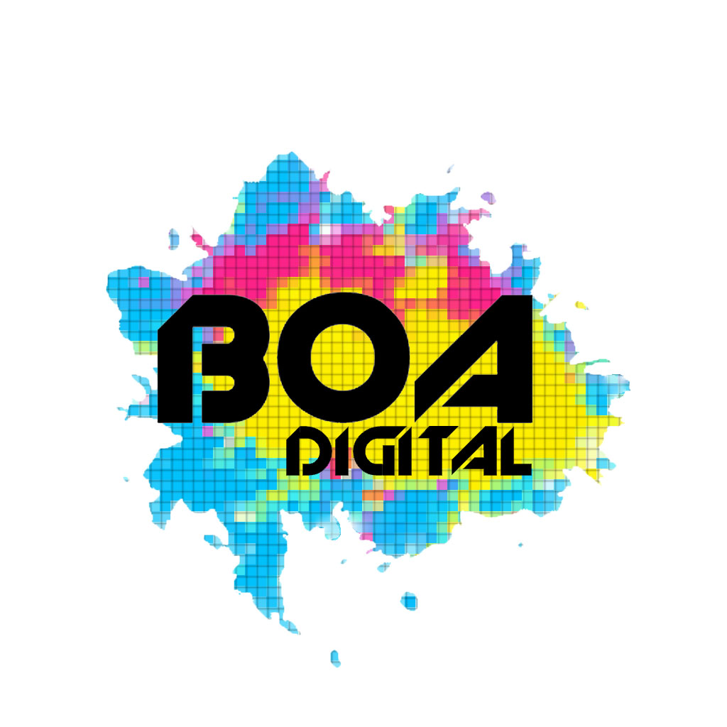
After refining the first logo further I created a more developed logo with more colour and art. I wanted to express what ‘BOA Digital’ stands for within the logo. I created a pain splatter effect then distorted the HUE and Saturation to add more colours and get the colours more vibrant. After tweaking the position of where the initial logo would be placed ontop of the paint splat. Although I felt I had created a logo which showed the artistic side of ‘BOA Digital’ I did not feel that the logo represented the ‘Digital’ aspect so I looked into different gallery filters and smart filters I could use to manipulate the logo without distorting it but to create what effect I wanted it to which was to pixelate the paint splats in the background. After spending time with tweaking the pixel effect I found the correct mix between making the image look pixelated yet still flowing. I was happy with this final product but decided not to continue using the first ‘BOA Digital’ design as I felt it didn’t have enough connection with the pixel background and I wanted to refine more logo’s using the background.

After experimenting with many font styles, I decided to keep in with the pixel theme and find something arty and representative of what BOA Digital is. The font used was pixeled yet chunky and easy to read. The font also would be recognizable if it were to be used on other BOA Digital media forms. I had also re-sized the splatter to make the logo seem more corporate and more geometrical. I was really happy with this logo as it seems commercial and portrays a good message about what BOA Digital is all about.
BOA Games Logo Creation

After creating a BOA Digital Logo Design, I was chosen to manipulate the logo and create something similar yet more professional to be added onto future games and apps, produced and created by BOA. I was going to keep the splatter and pixel effect as the BOA Digital Logo Design did but recreate it and make it mean something. I decided to use the West Midlands boundary as a template for the paint splatter which I would create in Photoshop.

I mapped out the area of the West Midlands and filled it. I then added more sections which I would later fill with different colours from the same colour scheme as the BOA Digital Logo Design. I would add the paint splatters after completing these steps.

I added a yellow section and blue splatters making the shape of the splatter seem less intentional and more natural.

I also added a pink section corresponding with the BOA Digital Design. After this step I did some further paint splats and touched up the shapes to make them seem more natural. Then using filters I created a similar pixel art effect onto the splatter making it look more retro. And finally finishing with adding the BOA Games text using DAFONT font ‘Digital Anarchy’ onto the Logo.
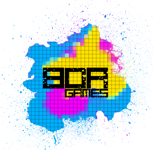
This was the final BOA Games Logo which was used within the REP Games. I was very happy with the finished logo as it looked colourful and artistic, reflecting BOA Games and game creation. It also showed a clear path of idea development and full representation of what my main goal was and what I aimed to achieve.
These are multiple designs created for the BOA Digital Logo Design.

This design is a version of the final BOA Digital Logo Design I created however I changed the colours of the paint splatter to see how this would affect the look. Also I took away the pixel filter and replaced it with a water colour filter to make the splatter less edgy. Also I made the edges of the splatter more flowing and alot less edged.

This was a new design I did to experiment with how the logo would look with a different style. The font style looked professional but the fire effects did not relate so I decided against developing this logo further. The fire was created however by editing brush strokes on top of a sources image of fire which I added multiple filters to give the logo a stylized appeal.

This BOA Digital Logo Design was based of the original yet I wanted to take away the colour and experiment with a black and white theme. The background of the logo was produced by different sourced splatter images and paint brush effects within Photoshop. The text was then added on top and I added a glow effect so that the black text was visible.
